
Full Stack Development: COVID Web App
Environment
Python 3.6 with: Dash, Plotly, Dash Bootstrap Components, Pandas, Matplotlib, Numpy, Scipy, Datetime, JSON, os
A conda environment for the web app was created, and all of the programming was implemented in python scripts. All of the associated files have been placed in my project repository on Github, and the README.md file provides instructions for how to use the scripts and deploy the web app to Heroku or locally on a Windows machine.
Introduction
Update (August 7, 2020): A new version of the app has been deployed on AWS. Discussion the new deployment can be found here: https://buckeye17.github.io/Docker-and-AWS/
The new app can be found here: http://seecovid.eba-ishvxpm4.us-east-1.elasticbeanstalk.com/
Having often used Johns Hopkins’ COVID dashboard, I was impressed that it gave access to COVID-19 data worldwide with a simple interface. But it left me wanting in a few respects:
- COVID-related history curves for various regions and for various case counts (like confirmed or deaths) could not be plotted together.
- The bubble map makes it difficult to see and compare plotted values. A heat map would be better suited for this purpose.
- Per Capita values aren’t available.
The primary goal of my dashboard was to provide a very flexible interface so that users can alter the plotted values as they desire. In addition, I investigated whether simple projections could be made from the months of data. But after completing a few models, I felt it would be irresponsible to make novice projections. Instead, I decided to make sandboxes where a basic epidemiology model could be explored.
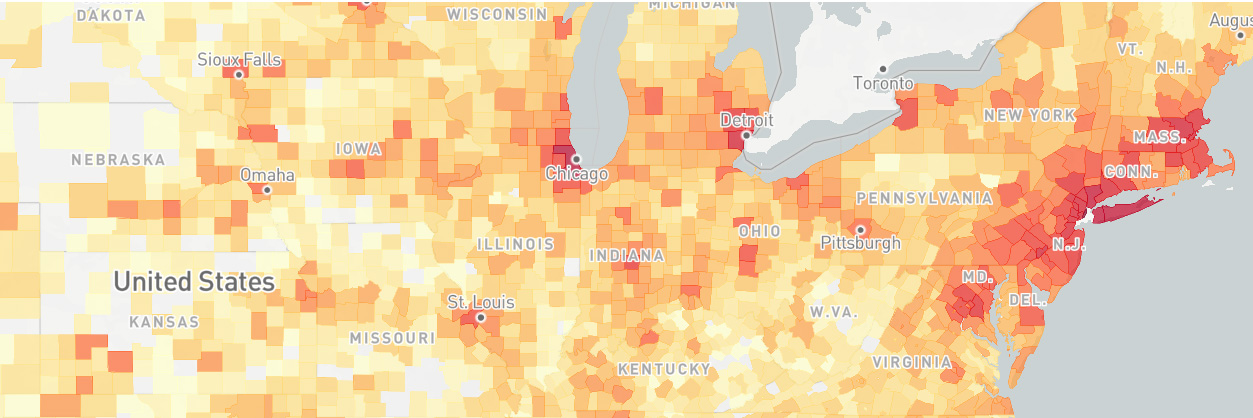
A screenshot of the finished dashboard is provided below.

Discussion
Data
There are three kinds of data used in this app:
- Johns Hopkins’ COVID-19 data
- Population data to enable per capita calculations
- Geo JSON data to define the boundaries of geographical regions used in heat maps
Links to all of these data sources have been provided in the “Links & References” tab within the app.
Most of the data wrangling effort was needed in cleaning the raw data from Johns Hopkins. This data is provided in csv files created for each day since January 22, 2020. These files are downloaded daily from Github and then read into Pandas dataframes and then appended together into a single dataframe. Many inconsistencies in the data had to be resolved, which include:
- Names, such as “Bahammas”, “The Bahammas” and “Bahamas, The” needed to be standardized.
- US data was initially reported by city, but beginning on March 22 it has been reported by county. This was resolved by subsuming city data into the state level aggregate. Hence some states will have a longer history than any of their counties.
- Cruise ships and Wuhan evacuees were defined as though they were states/provinces. These were instead subsumed at the national level aggregate.
- Small oversees territories were mentioned as states, such as French Guiana for France. These territories were also subsumed at the national level aggregate.
After those types of inconsistencies were resolved, there were duplicate rows such that for a given region and date, there were multiple values in the dataframe. These duplicate rows were aggregated by summing them into single rows.
Another form of wrangling was to undertake all calculations from basic values. This was done because updating the heat map figure is a slow/expensive process. Deriving all necessary values ahead of time will make the app more performant. The calculations include deriving active cases (= confirmed - recovered - deaths), new cases for each date based on cumulative case counts for each date, per capita values and new cases for each date per capita. Furthermore, where counties, states or provinces were defined, the rows were also aggregated into new rows representing higher level values (county rows into state rows, state rows into country rows).
Lastly, the dataframe variables were modified from Object and float64 data types to smaller types, such as categorical, uint16 & float16. This reduces the resulting dataframe pickle file size from 250MB to 27MB. One issue with unsigned integers arose where new cases per date were calculated to be negative because the total number cases actually decreased. Without setting the minimum to zero for new cases per date the unsigned integer would rollover into an enormous number. As of May 14th, there are 405,000 rows in the clean dataframe.
The above data wrangling is accomplished entirely in a Jupyter notebook to make data interrogation easy. Each time the notebook runs, it will automatically download all of the available Johns Hopkins csv files from Github and when finished, produce a single, clean dataframe that is saved as a pickle file.
The remaining data wrangling tasks were to find population data sources (i.e. the US Census Bureau or Wikipedia) and Geo JSON files. With each of the data sources (11 in total), some effort was required to adjust either these data sources or Johns Hopkins data so that each of the regions could be matched across the datasets. Population data wrangling was done in this short Jupyter notebook. Note that the population dataframes produced by this notebook are inputs into the Johns Hopkins notebook described above. Most Geo JSON data wrangling was done on the Johns Hopkins region names as opposed to modifying the JSON files, except for the Chinese provinces files. In this case, the province names were in Chinese characters, so the JSON file was modified. Links to all 11 data sources are provide in the “Links & References” tab within the app.
Modeling
Curve-Fitting
Curve fitting was accomplished with the Pandas rolling() function, which allows rolling averages to be calculated. The user can adjust the maximum width of the rolling window, changing the sensitivity of the fit as desired. The minimum width of the window is set to 1 so that a fit appears for the entire duration when data is available.
Simulating Epidemics
The epidemiology sandboxes contain their own introductory material to explain how the models work, so that information will not be repeated here. Fundamentally, these SIR models consist of three ordinary differential equations which describe the rate of change in each population segment (susceptible, infected & removed). The equations are:

Note that gamma = 1/d and beta = gamma * r0. This system of equations was solved using the function scipy.integrate.solve_ivp(). The equations are continually solved for future values until the number of infected people is decreasing and they changed by less than 1 over a period of d days (meaning the number of infected has burned out). The two user-defined epidemic scenarios are then compared and whichever scenario was shorter in duration is then re-run in order to match the longer duration.
Dashboard Development
Ultimately, ~3,400 lines of Python were written (including comments and whitespace) in the full pipeline to produce this dashboard. It was developed using the packages plotly|Dash and Dash Bootstrap Components. Dash enables developers to deploy plotly interactive figures to a server as a Flask app. Dash Bootstrap Components extends Dash’s html capabilities with the popular html Bootstrap framework, which is designed to, “build responsive, mobile-first projects on the web.” Dash Bootstrap Components also supports 20 Bootswatch CSS themes to produce different website styles.
Dashboard Deployment
Lastly, the dashboard was deployed on the Heroku platform, which provides hosting services spanning from free personal accounts to enterprise accounts. Deployment is accomplished by a command line tool which enables Git repositories to be pushed to Heroku. A custom environment is then built and the web service is launched. All of the tools above enabled a public web-based dashboard to be deployed using nothing but Python and git.
Based on my experience deploying a Heroku another app, I knew that the app’s memory is ephemeral, meaning that once it is deployed, the data cannot be updated in any permanent manner. I had hoped to avoid this by storing my daily-updated Pandas pickle files on my Google Drive, but this was unsuccessful because I could not complete the authentication with Google in the Heroku headless environment. For now I will re-deploy my app daily to keep the data up to date. Options to access cloud data AWS or GCP are available on Heroku, but they cost $10/month.
Challenges
In addition to the challenges of wrangling the data described above, the following list is meant to highlight the various challenges I encountered in this project as well as to share some of my solutions.
- Using Geo JSON files was a new experience for me. Finding files which defined the boundaries of desired regions was pretty easy (simple searching), but editing the files and crawling the JSON fields to find regions which didn’t match my COVID data took some time to figure out.
- Plotly|Dash supports figure animations, but implementing them is not easy. To make matters worse, the animations of the heat map figure became unstable within just a few frames because the labels of the bars (for Top 10 regions) varied in length as some regions dropped off the plot and others were introduced. This was resolved by limiting the label length to 25 characters and padding labels with space characters when they are less than 25 characters. The animation still pushes the limits of my laptop’s browser, but it is more stable than when it was first completed.
- There were a multitude of tedious layout issues. Hundreds of tweaks to CSS elements are manually defined in this app. These tweaks ensure spacing of elements is uniform or centered or justified as appropriate. In addition, many items have been tuned to change width as the screen size decreases so that all screen widths are accommodated. This web app is intended to be “desktop first” rather than “mobile first”, but I’m happy that it is usable on mobile as well.
- I originally developed this app with Python 3.8, but Heroku provides 3.6 as the latest Python option. Unfortunately this broke my app because a new pickle file option was introduced after 3.6 which my code was using. So I had to create a new virtual environment on my laptop based on 3.6 in order get the app to run on Heroku.
- Initial testing and feedback from friends after deployment indicated that app load times were terrible. In my own testing, I found the initial landing page to take anywhere from 15 to 50 seconds to load. This was caused by using a free configuration, which limited how many concurrent sessions were feasible and limited the RAM which the app needed to run quickly. This was resolved by a few modifications: (1) using my Jupyter ETL notebook to derive the expensive heat map data structure first seen when visiting the site. (2) modifying the Gunicorn configuration so that the app is preloaded and will use no more than 2 workers per dyno. (3) most importantly, I upgraded the host machines from the free option to professional, doubling the RAM from 500MB to 1GB.
What Could Be Improved?
Since the heat map animations struggle to perform well in the browser, I would like to remove this feature (while leaving the slider that lets the user jump to arbitrary dates) and add a new tab where the animations can be shown as GIFs. This appears to be feasible without a lot of work. I’m not sure if I would generate the GIF files prior to deployment, or give the app the ability to generate them on the fly. I expect they would take more than 10 seconds to generate, which I would want to avoid.
I’d also like to add a tab which plots the history of r throughout the epidemic in all regions. I didn’t know this could be accomplished simply with data on confirmed cases until the day I published this (May 14). According to the Wall Street Journal European countries are watching the change in confirmed cases as a measurement of r. This would be relatively easy to implement.
Including mortality rate values (deaths divided by confirmed cases) would be nice. But this would require special treatment for aggregating values from county to state to country that is different from my current code base, and it would also require different UI controls.
Johns Hopkins’ dashboard includes a lot of other data (like the number of COVID tests runs, the number of hospitalizations, etc.) that isn’t available in the csv files I’m using. It would be nice to include this data (assuming they provide it in other files), but my experience with their data is that would need a lot of cleaning.
Lastly, I would like to see an app layout that better accommodates mobile screens. The figures in my app are all meant for wide screens. More thought could be applied to designing figures for narrow screen formats.